

Memor: challenging conventional calendars with fluidity and tone of voice
Snapshot
Role: Sole designer on my 4th year Honours project: ideation, research, prototyping and every deliverable submitted
My honours project: a conceptual app that treats productivity guilt as the problem. Replacing the calendar grid with a fluid shape and using tone of voice profiles that talk to you like a friend. Focused on making you mindful of how you're spending your time with custom interventions.
Digital and physical calendars
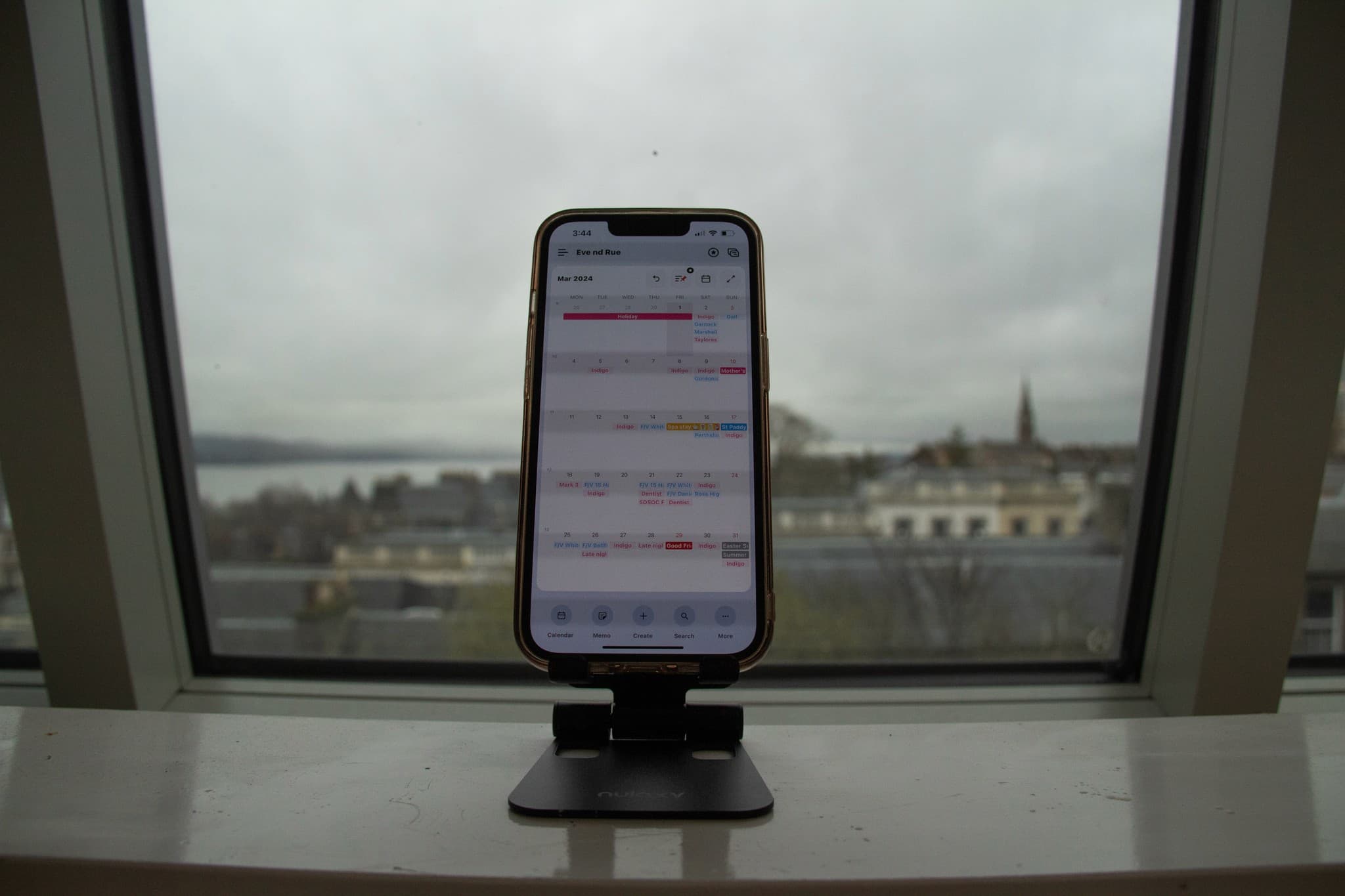
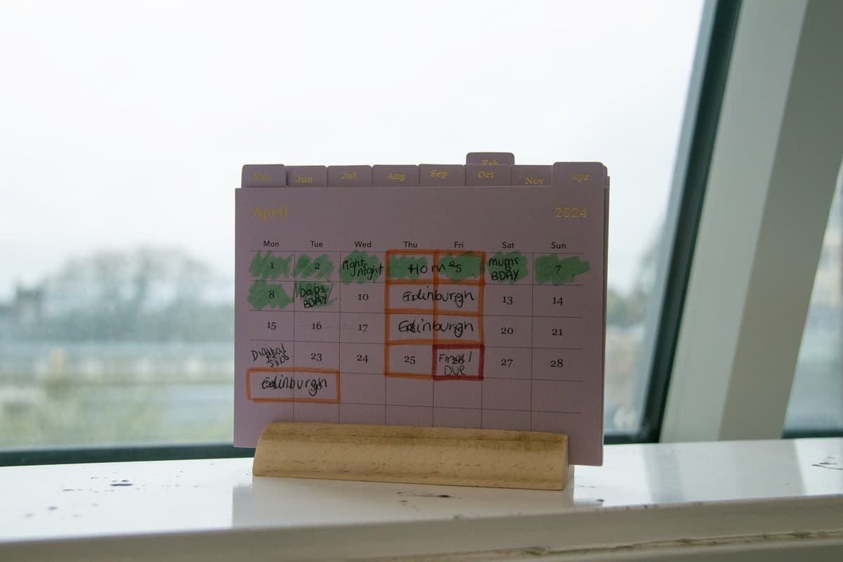
One of the first things I did was walk around the studio and ask people, do you use a calendar? I got a mixture of physical and digital calendars.
What's the positive of each? Along with some initial research I had come to a key insight: Digital calendars offer more flexibility than physical calendars, but physical calendars offer more visibility than digital ones.
My aim quickly became to create something in the middle ground. Creating something which utilised digital flexibility, but leans into physical visibility would be the best of both worlds for a new innovated calendar. This lead to looking into data visualisation, and how we can represent our calendars in a new, fluid way.
Make the calendar a fluid shape, not a grid
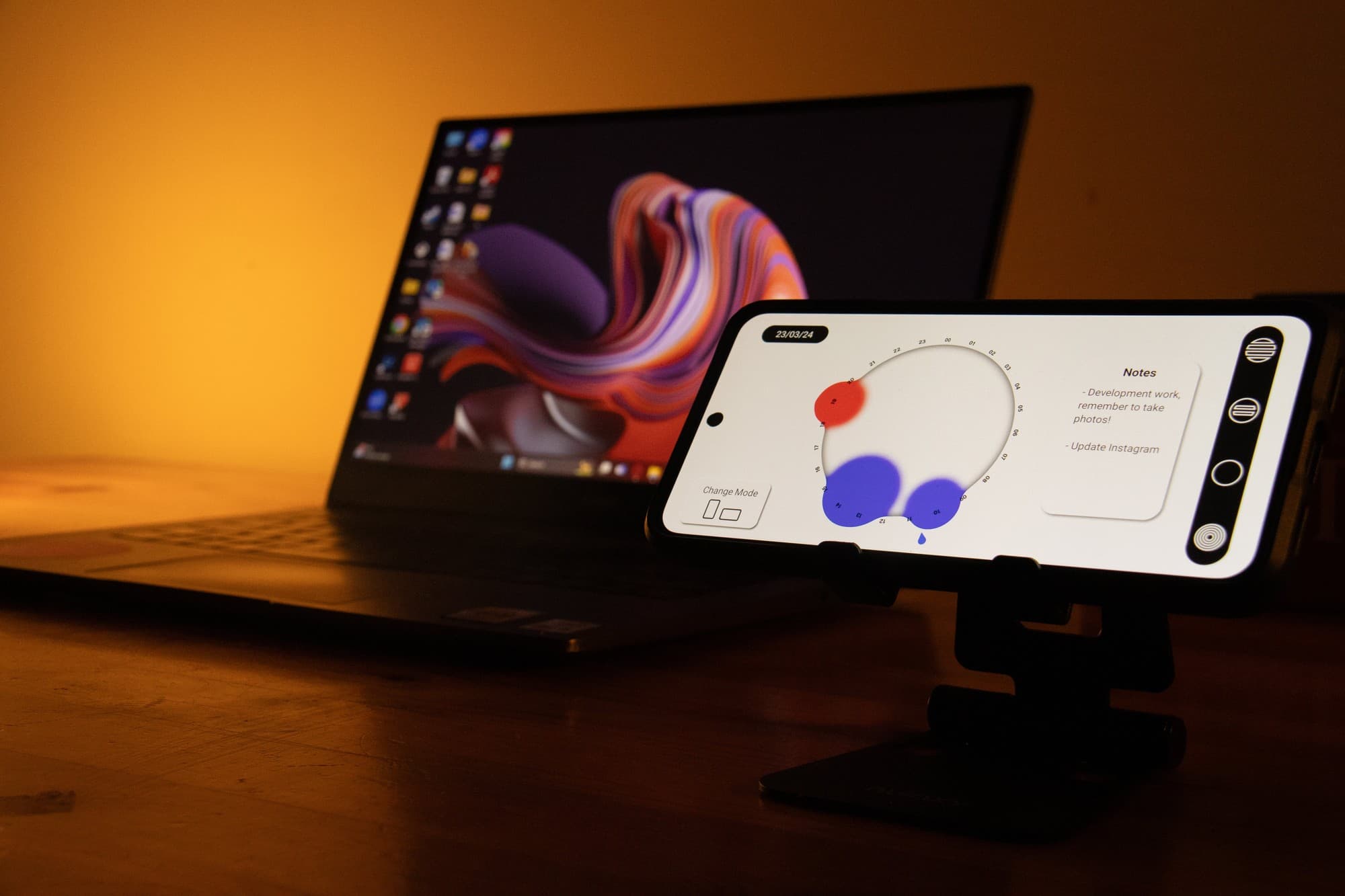
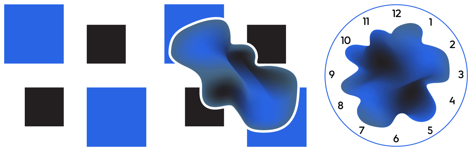
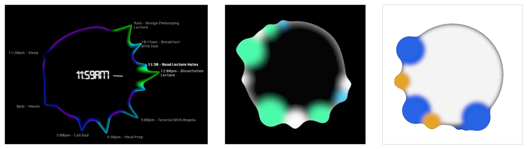
I started conceptualising how to transform geometric, static layouts into fluid and organic shapes while still representing a familiar calendar. The first step is shaping the design into a fluid yet readable form. To keep it familiar and avoid an "alien" feel, I incorporated a clock face into the initial concept. This was a very strong starting point and allowed me to iterate towards the final look.
Achieving the look I wanted was tough, I had to use Adobe After Effects to generate short clips which would be used in the prototyping software Protopie. This was a mixture of software I did not intend to explore, but it worked really well.
Drop "App Talk" for a brutally honest voice
I decided against the usual "app talk", it's niceness that does little for real motivation. I instead opted for a brutally honest voice, like a friend who keeps you in check. Same nudge, same moment, only the tone changes.
Which one is more likely to actually get you on a walk?
App talk
Here's your reminder you should be on a walk now.
Brutally honest
You are an idiot, go on a walk, stop burning out at your desk.
I did later add two other profiles for those who didn't want the bluntness: one which spoke to you like a supportive bestie, and another that told your story in third person.
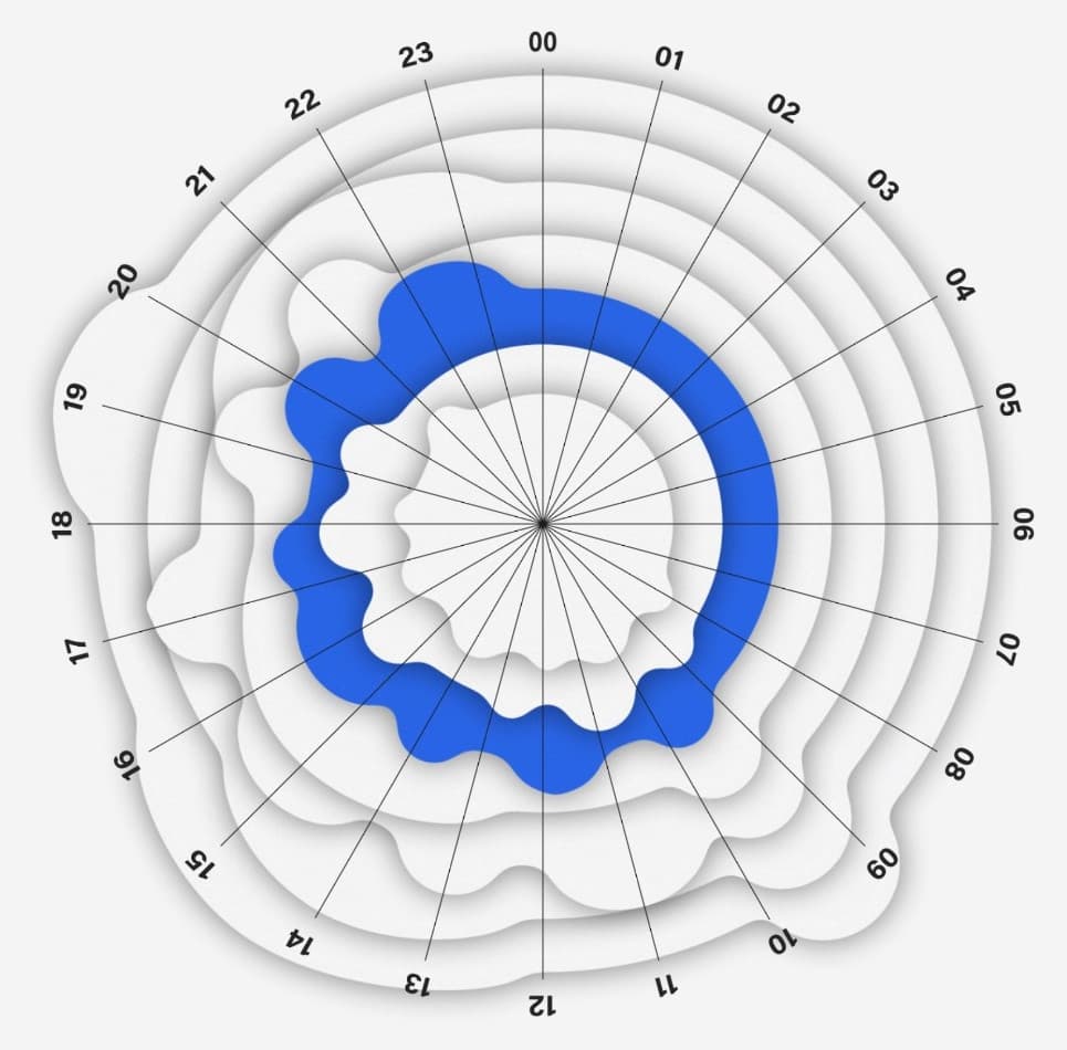
How do we visualise a week?
To compete with existing calendars I added a weekly view by stacking the daily shape into a visually stacked week. This unexpectedly made weekly trends visible: it was easier to spot your busiest and quietest times in a week.
Submitted
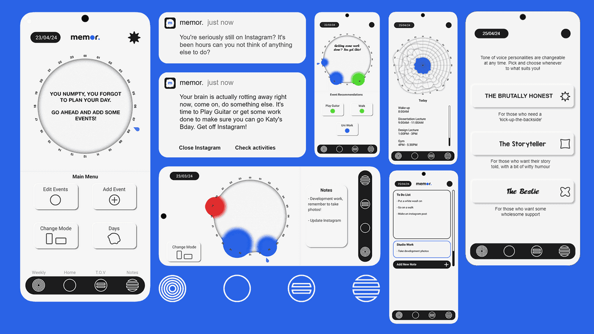
High-fidelity prototypes: the fluid 0–23 clock-calendar with event circles, animated event management, three tone-of-voice profiles, a stacked weekly view, and notes.
I created 3 different scenarios for the final prototype.
- The user is scrolling on social media and is prompted to do something better with their time
- The user is working and is prompted to take a break
- The user wants to add an event to an already busy day, and the calendar rejects it
I also made a final video showing what the project stands for. It follows the experience of productivity guilt, and where the app steps in to ease it.
Impact
The project was awarded a first. It was exhibited at the DJCAD degree show, in front of an audience that included people working in the industry.
The reaction that stayed with me came from a visitor with ADHD. They said the fluid shape made the day feel less cutthroat about start and stop times. It would also stop them planning too much, or doing too little. That is one conversation, not a finding. But I had designed that shape to challenge the grid and take the guilt out of a calendar. It turned out to do something I hadn't designed for.
Reflection
This was a very fun conceptual project, pushing the limits of how I could represent a calendar visually. I picked up After Effects and wired it into Protopie to get the fluid shape moving. I paired it with a tone of voice no calendar app would dare ship.
What I took from it is that the far-out concepts are worth chasing, and approaching something in a genuinely new way carries its own value. The degree show was the proof. A grid would never have prompted what that visitor told me, because what they responded to was the part that broke convention.