

Last Active Filtering: a hidden definition, now admin-controlled
Snapshot
Role: Junior UX Designer on Genio Admin, design lead within a cross-functional trio
Admins couldn't tell which students were genuinely falling out of Genio Notes, so they couldn't follow up correctly. I let each institution define what Active, At Risk and Inactive mean to them. It beat its 20% Q2 target, sits at 25.4% and climbing, and answered a blocker at our largest institutions.
There was no way to filter by Last Active status at all. The RAG statuses behind it were fixed at 0–7, 7–14 and 14+ days, and invisible to admins. I suspected few admins knew what the colours actually meant. I tested that rather than speccing from it, and it held up. The fix wasn't a better filter, it was handing admins the definition itself.
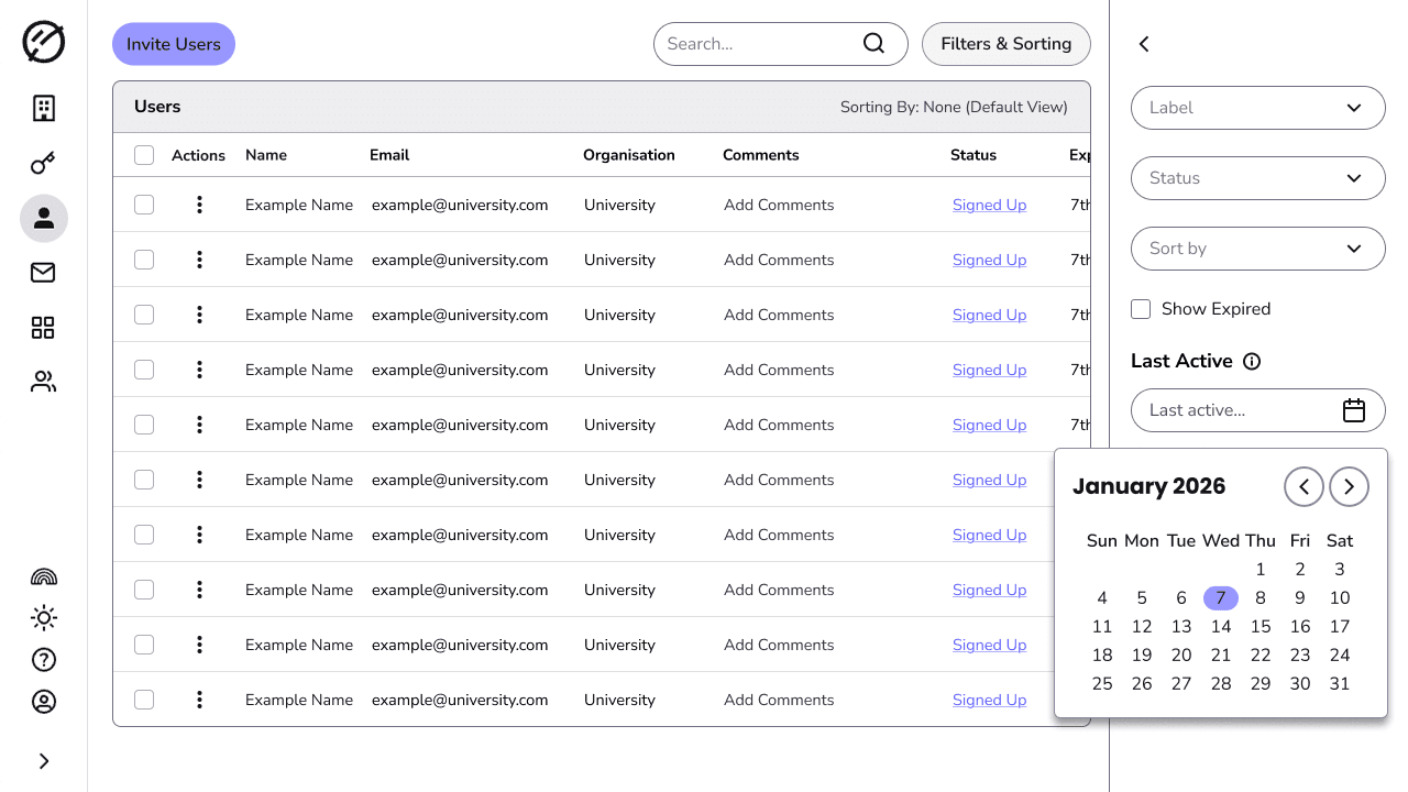
Why not a date picker?
Typically, a date picker works for this: pick a cut-off date, and act on those users based on that usage info. However, admins still had to know what date to pick first: day of the week mattered, what time of year it was, and other factors.
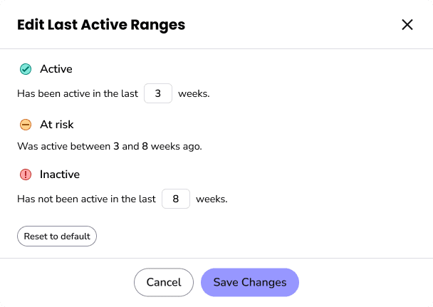
I saw a gap for a stronger solution: let admins choose what the RAG statuses meant to them by deciding the ranges for each status themselves. That extra control meant they could set ranges to match their own understanding of what active meant to them.
I put both solutions head to head in a survey with our Admin Insiders group. They preferred custom ranges, and the reason they gave was the sense of control it offered, not the filtering itself.
Exploring how admins set the ranges
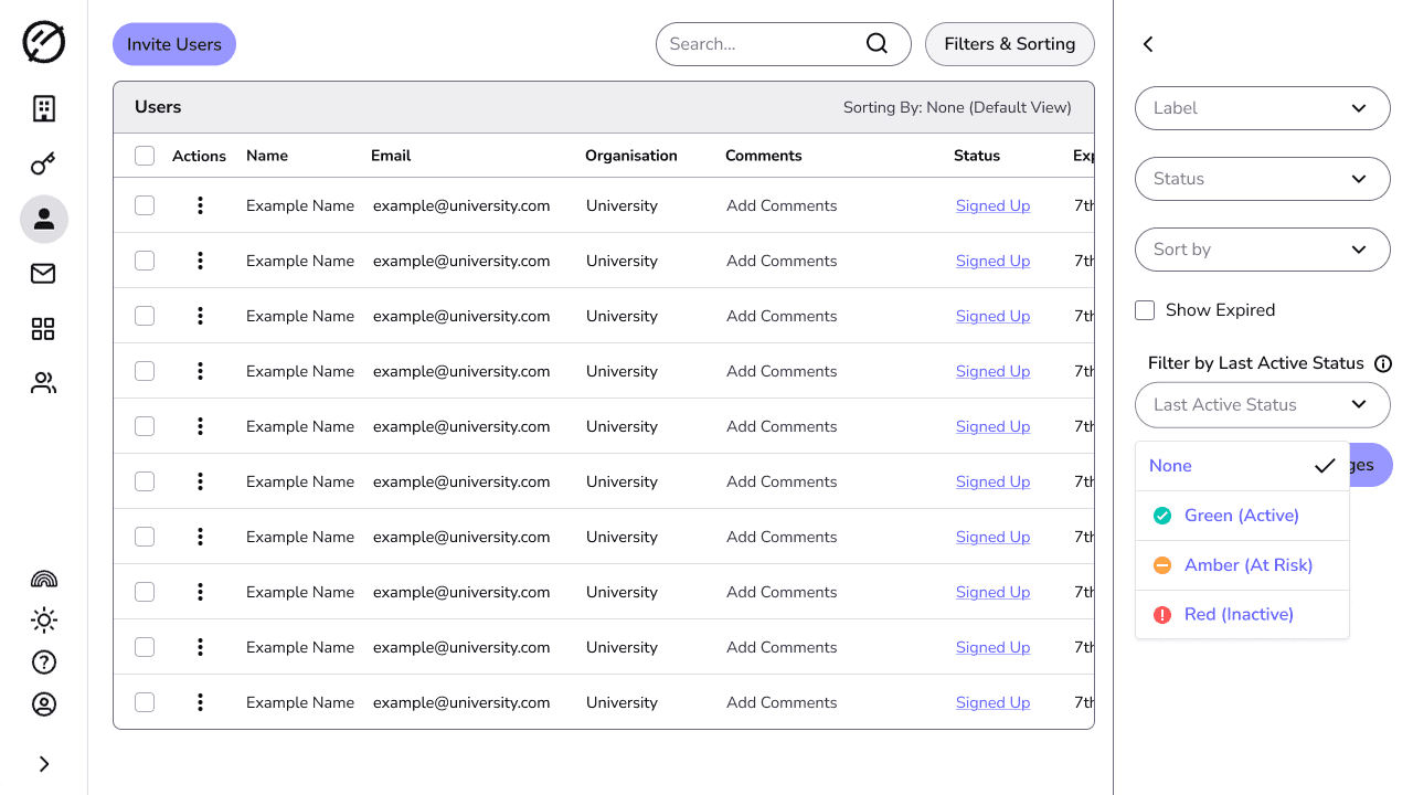
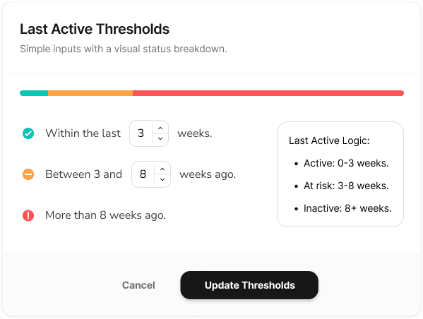
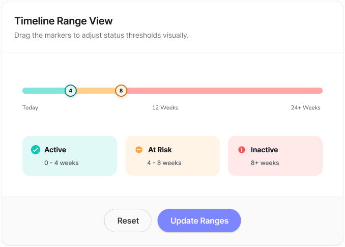
I wanted the custom ranges to be easy to use and understand, and settled on using weeks as a unit of time rather than days or months. I did some ideation around visualising the ranges, and the interaction of setting them.
I eventually decided against a visualisation, as I felt it wasn't needed to understand the set ranges.
What do admins really think about it?
For extra validation we ran sessions with four institutions across the UK and US, all Genio admins working in accessibility and disability services. Rather than taking them through it, I put them in the driver's seat with a high-fidelity prototype I created.
Reactions to the filter were immediate: one admin called it “great” and “very useful” on sight. They went on to say the work “makes the portal more user friendly”, and another could see it “saving quite a bit of time”. These were reactions to a prototype rather than the shipped feature, but the intent landed without me having to explain it.
It also surfaced what a demo wouldn't: once admins could isolate a group they wanted to act on it, export it, email it, bulk deactivate it.
Shipped
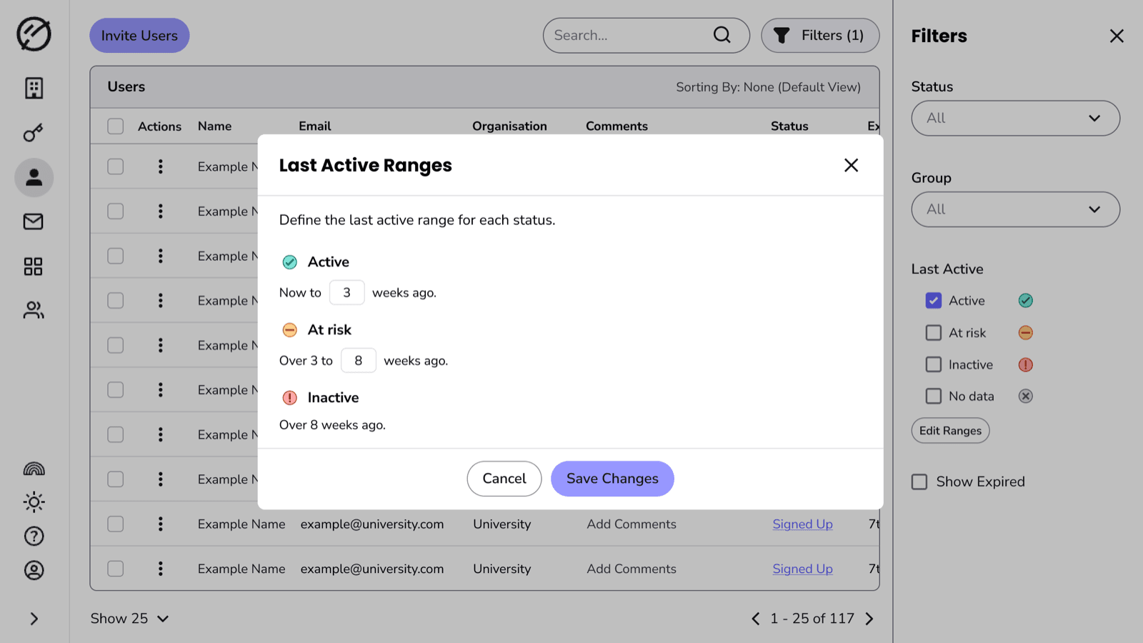
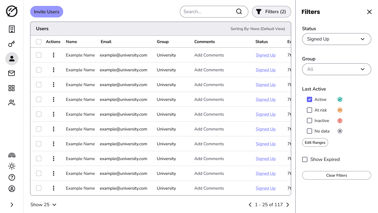
A Last Active filter in the users table, with the four states as checkboxes, each carrying its status icon. An Edit Ranges control opens the editor, where an admin sets the week boundaries for Active, At risk and Inactive.
Impact
A 20% adoption rate was our key Q2 objective. It hit 22.7% by review and 25.4% today, all through the academic quiet season.
It also answered a blocker at our largest institutions, where IT teams doubted they could manage users at that volume. Two deals were riding on it, so the PM and I went to them. One was weighing up whether to renew at all; they renewed once they understood what was coming, before a line of it shipped. We reached only one of the two, but the objection has an answer now.
Before this, an admin sorted by last active, read each date, and decided user by user what it meant. Bulk deactivation already existed; what it lacked was a list worth running against. Now the ranges carry that judgement and the filter returns the group, the saving admins raised most.
Admins went from having no say in that definition to setting it once. They stay in the driver's seat, where they should be.
Reflection
The obvious fix, a date picker, would've only solved half the problem. What I'd carry forward is the sequence: treat the hunch as a hypothesis, put it head to head with the obvious answer, then spec it.
The other lesson was handing the prototype over rather than demoing it. Watching admins isolate a group and reach straight for exporting, emailing and bulk deactivating it taught me more than a walkthrough would. It shaped the roadmap beyond this feature.