

Making an audio interface accessible without making it visually loud
Snapshot
Role: Junior UX Designer on Genio Notes, taking on the more complex WCAG compliance work
Genio Notes' audio capture interface (audio bubbles) failed WCAG 2.1 AA contrast. Our CEO raised a concern: simply strengthening the colour to pass would increase cognitive load for what is mostly a background element. I met contrast in the borders and the weight instead of the fill. That led to a cleaner, lighter interface.
Each colour marks a different note type: important notes in red, notes flagged for review in yellow, and regular notes in blue. The audit found failures in both modes, and not the same ones. In dark mode grey (4.04:1) and yellow (3.5:1) passed, while blue (2.94:1) and red (2.42:1) failed. In light mode only red passed.

How do we meet contrast, but keep the UI light?
Raising the saturation to meet 3:1 contrast read as muddy and heavy, exactly the tradeoff the CEO had flagged.
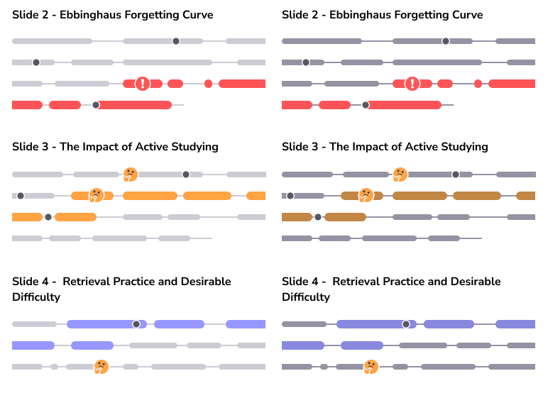
I tried various approaches, making the bubbles thinner but stronger, an empty fill, a light fill, and more. Having a light fill for the inactive bubbles and a stronger one when they were active hit the sweet spot.
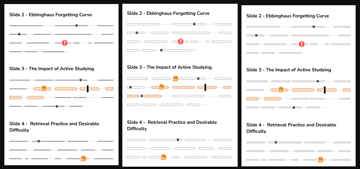
The final solution added a light background fill with a border that passes contrast checks. Getting there took a few tweaks: I reduced the connecting lines from 2px to 1px, and shrank the bubbles themselves, inactive ones from 8px to 5px, active ones from 12px to 11px. I kept those sizes odd so the bubbles would sit centred on the thinner line.
Pushing for the lowest cognitive load
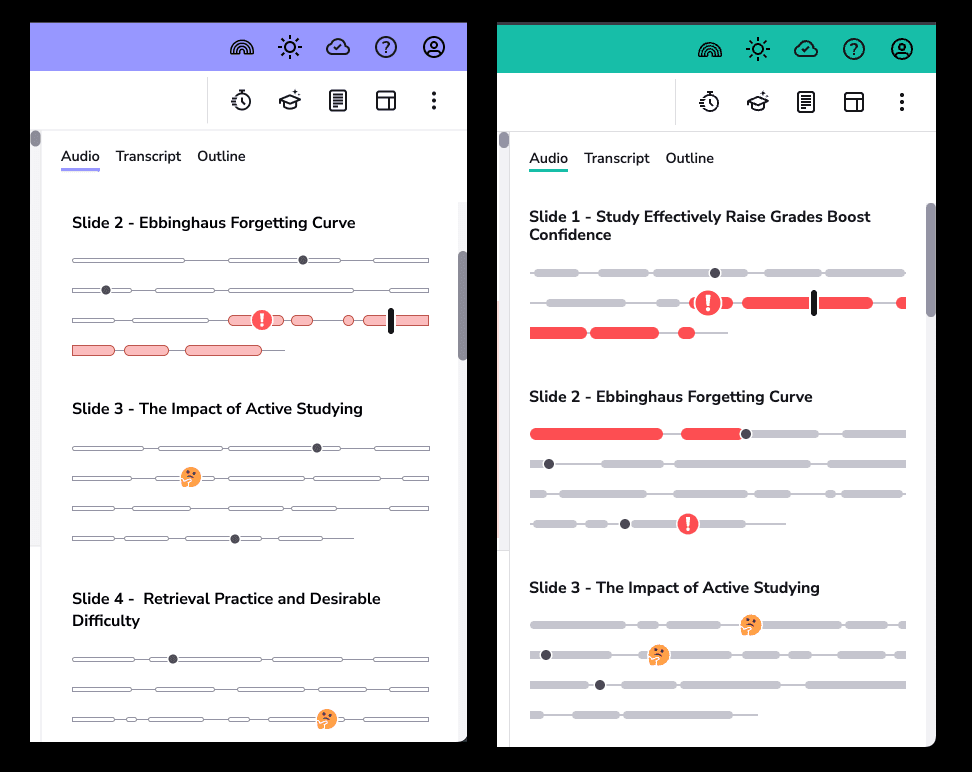
To go further, I explored dropping the opacity of the connecting line, or removing it entirely. Our accessibility expert liked the idea, but suggested I double check first.
I put the question to an external WCAG auditor. Their answer: decorative lines are exempt, but lines that are interactive and convey essential context are not. Since our lines are interactive and give context for the empty audio between bubbles, that reversed my decision. I kept them at full opacity, with contrast that still passes.
Testing with power users
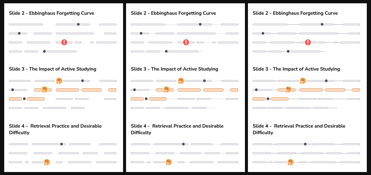
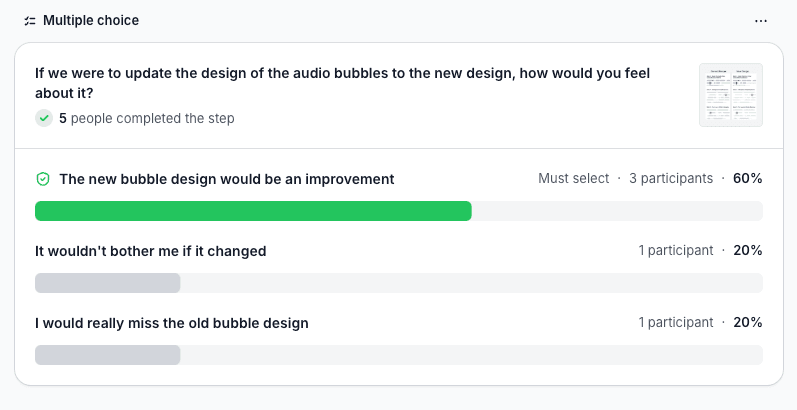
I surveyed our heaviest audio-tab users, cross-referencing usage stats against our Insiders group (customers who've opted in to being contacted). The survey compared the current and proposed designs on cognitive load, perceived polish (“beautiful and minimal”), and overall preference.
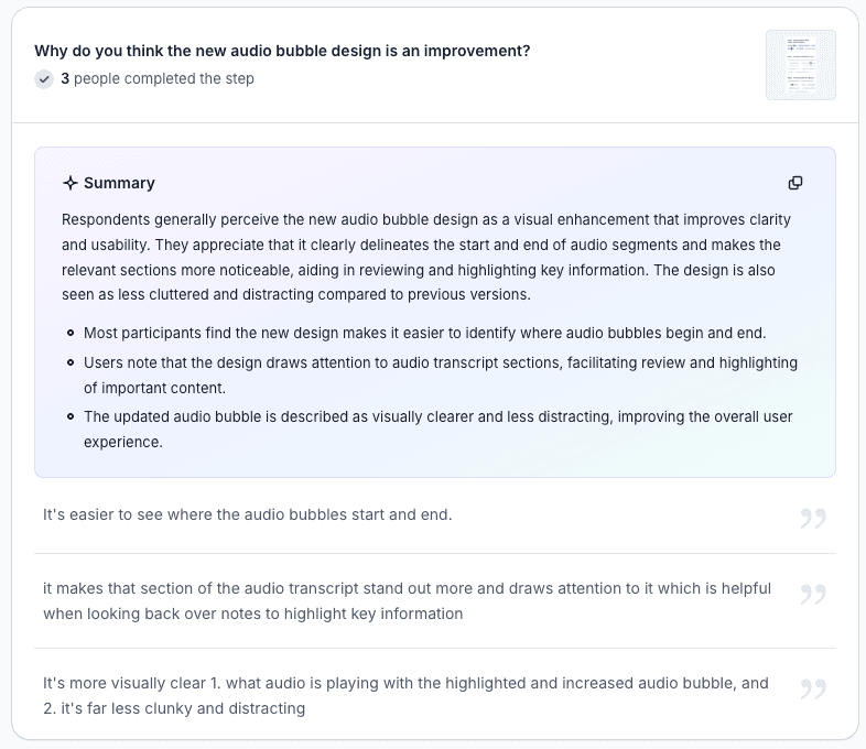
With only 5 responses, the sample was too small for hard conclusions, but the signal was promising: the new design won overall. It scored lower on “beautiful and minimal”, though that was skewed by a single 1/5 from a respondent resistant to any change. The clearest win was clarity: users found it easier to see where audio starts and stops, and felt it was less distracting.
Shipped
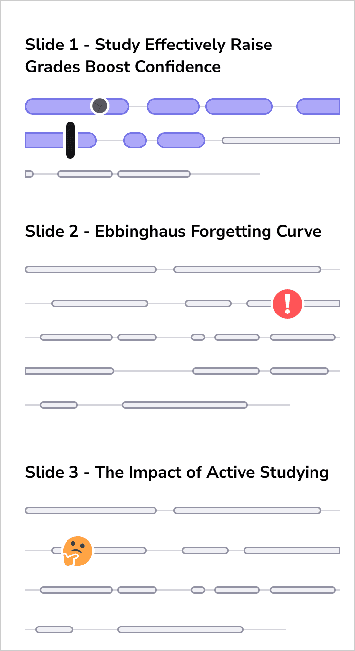
Contrast lives in the border and the weight, not the fill. An inactive bubble carries a background fill with a contrast-passing border, and a lighter fill when active. Lines stay 1px at full contrast, per the ruling. Heights of 5px and 11px keep them centred on the thinner line.
Impact
Every bubble colour now clears 3:1 in both modes, confirmed on re-audit, and without the cost our CEO had flagged. Contrast came from the borders and the weight rather than the saturation, so a background element stayed in the background.
That mattered commercially. WCAG 2.1 AA is a condition of selling into the US market. This was one of the failures standing between Genio Notes and a clean VPAT. The deadline driving it later moved, but the requirement didn't.
I also left usage logging on the tab in place, so any future investment there can be argued from data rather than instinct.
Reflection
All this experimenting came down to one principle: treat compliance as a prompt to rethink the design, not a box to tick. Forcing the fill to 3:1 would have passed the audit and made the product worse. Testing the alternative is what produced a design that worked better for everyone.
I took this from a failed audit to an interface that passes and looks better for it. That meant managing stakeholder input up to CEO level. It also meant bringing in an external authority to settle the one question we couldn't answer internally.